Not Entirely Successful
In any body of work, the artist will inevitably like some works better than others. Or, consider some more successful.
Visit the new page Not Entirely Successful for more insight into this conversation.
Not Entirely SuccessfulSketchbook Excerpts
Janet has been reviewing and plucking from old sketchbooks,
Sketchbook Excerpts is the hub linking to other new pages each with a theme and from different years.
Click the buttons below for respective Sketchbook Excerpt pages:
Doodles (2012) Sketching on the Fly (1991-1993)
Sketching West Virginia (mid 1980s)
Trees! Doesn’t Everybody love trees? (1990-1991)
Ten to the Negative Forty Third (Planck Time 10^-43rd)
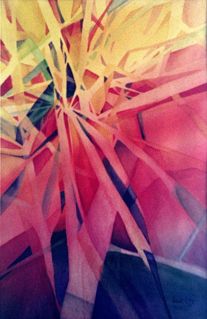 This painting can be considered non-objective rather than abstract. These two terms describe the intent behind the composition. A nonobjective painting uses color, shape, line without any reference to subject matter or recognizable images. An abstract painting can distort and exaggerate color, line, shape but usually there is some form of recognizable subject matter. Titles are always subjective, this title refers to my concept of the moments following what is known as the “big bang” in cosmology, when matter became visible. The progression of warm to very cool colors in the composition suggests temperature change and evolving matter. The many fractured shapes with radial directionality suggest chaos and a restructuring of material. In nonobjective and abstract paintings anything goes, there is a freedom implicit because there is no one right answer or way of depicting a concept.
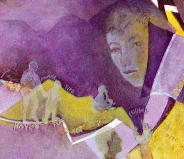
Personal Peaks
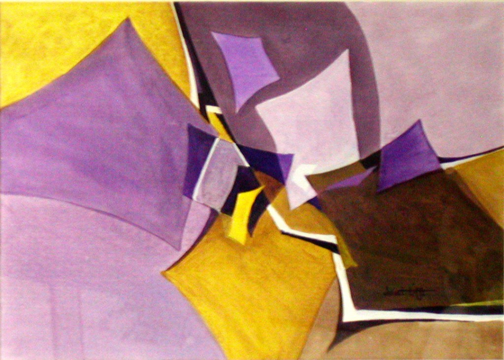
The original composition was an exercise using only complimentary colors plus black and white (not color) and one shape repeated, varying only in size and orientation. Purple and yellow are compliments with the greatest range in value, thereby allowing an almost infinite possibility of combinations. Whereas, for example, red and green are very close in value and have nearly identical gray scales.
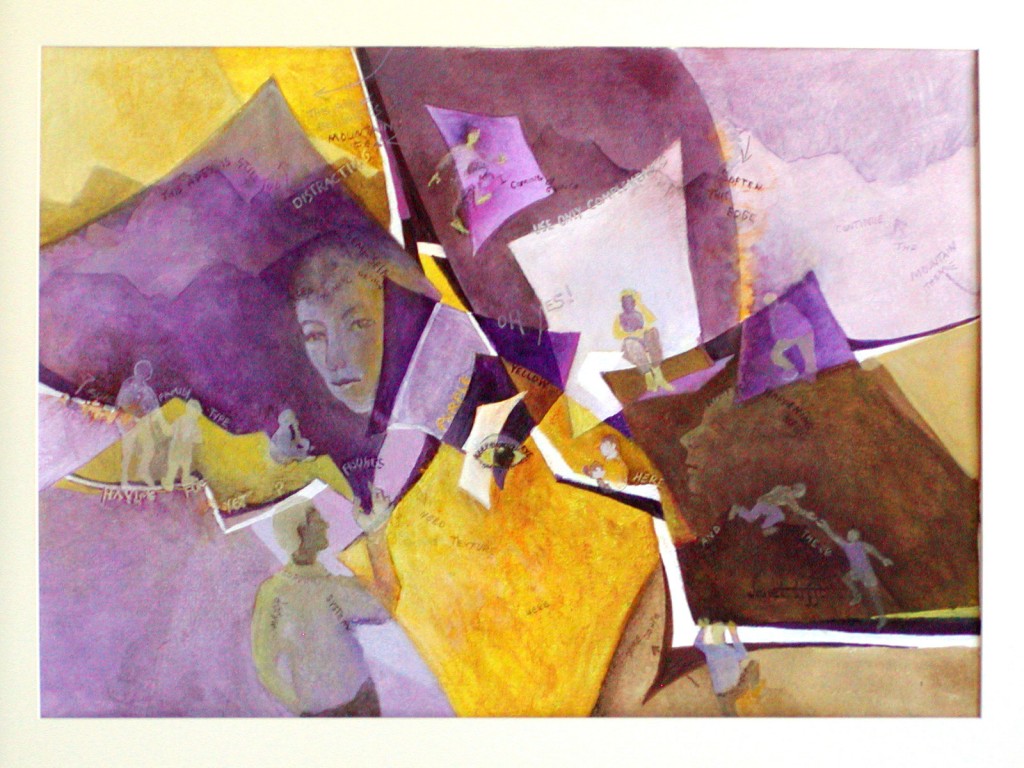
The second iteration is the recycling of the above abstract painting using representational elements and words.
Sneaky Self Portrait
The female peaking out behind the purple shape is myself. A wife/mother with a husband and 6 children, not much time for art! The words are an attempt at whimsy
Bits & Pieces
A gazillion pieces of cut out paper (a collage) with a desert theme – it’s supposed to represent a Palo Verde.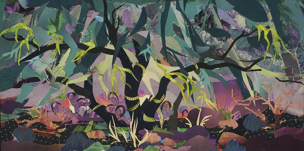 Basically a complimentary color scheme, bits of red and green. The black is a form calligraphy, in the sense of curvilinear shapes, suggesting tree trunks.
To comment on the entire blog, please scroll down to the bottom of this page. If you’d like to contribute to a discussion on a certain post, click the title of the desired post and it will redirect you to its dedicated page.
Contact

